Making a big platform feel small
Turning a feature-led platform into tools built around how nurseries actually work
Famly helps early-years teams communicate with families, plan staffing, run their nursery and document children's development. As the sole designer leading a new product vision, I spent a year rethinking how this growing platform could become simpler, clearer and more useful — alongside my ongoing product work.

A powerful platform that had become difficult to operate
Built around features, not people's work
Years of growth had made Famly increasingly capable. But each new need tended to become another page, feature or notification, exposing more of the platform's complexity to the people using it. Managers and practitioners had very different responsibilities and time horizons, yet navigated largely the same feature-led structure.
More than 45 navigation items sat above dozens of sub-pages, dashboards, timelines, tables and settings. Related tasks were spread across separate destinations, making staff learn the structure of Famly before they could get their work done.
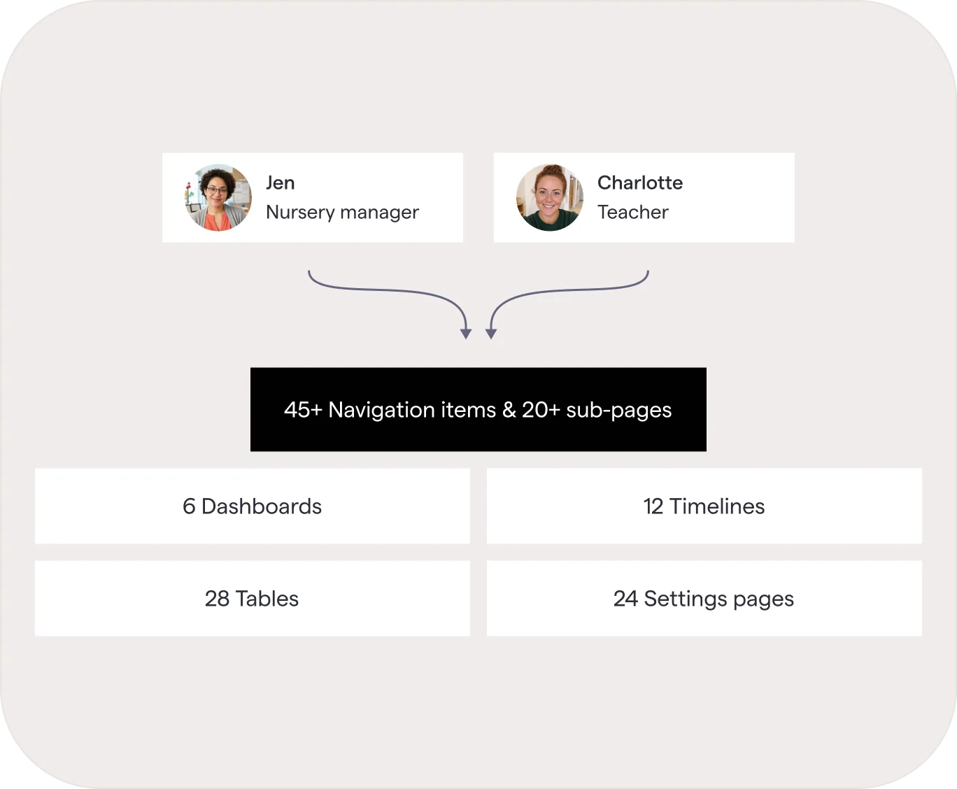
Forty-five ways in
The menu had become the map of the company rather than of the work. Every team that shipped something added a door to it, and nobody was ever asked to take one away.
The same product, whoever you were
A manager planning staffing for next month and a practitioner with eight children in front of her met the same menu, the same pages and the same defaults. The product never asked which of them was using it, so neither got a version shaped around the day they actually had.
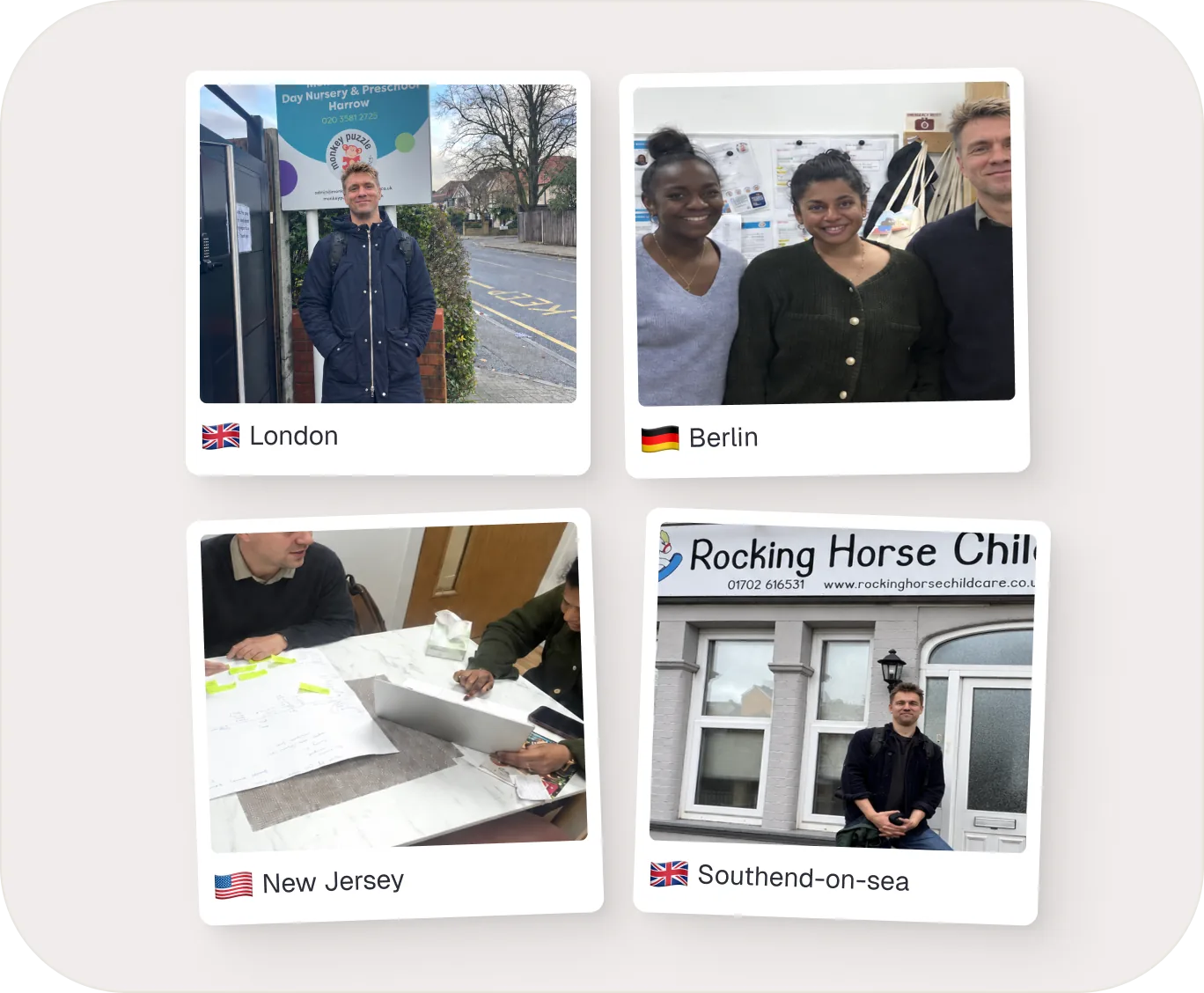
Four countries, one recurring need
I led customer research across the US, UK and Germany, watching nursery life first-hand rather than asking about it afterwards. Across every role the need came back the same: bring the right information together, and make the next step obvious.
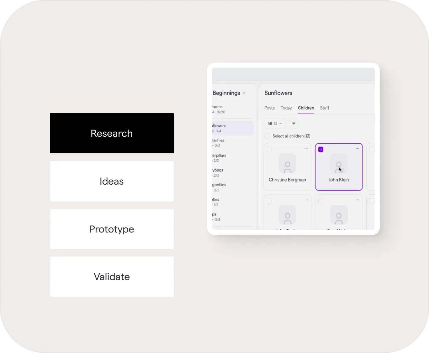
Prototyping at the speed of learning
AI let me turn an idea into something testable in hours. We could explore more directions, put them in front of users and stakeholders earlier, and keep changing our minds while it was still cheap to do so.
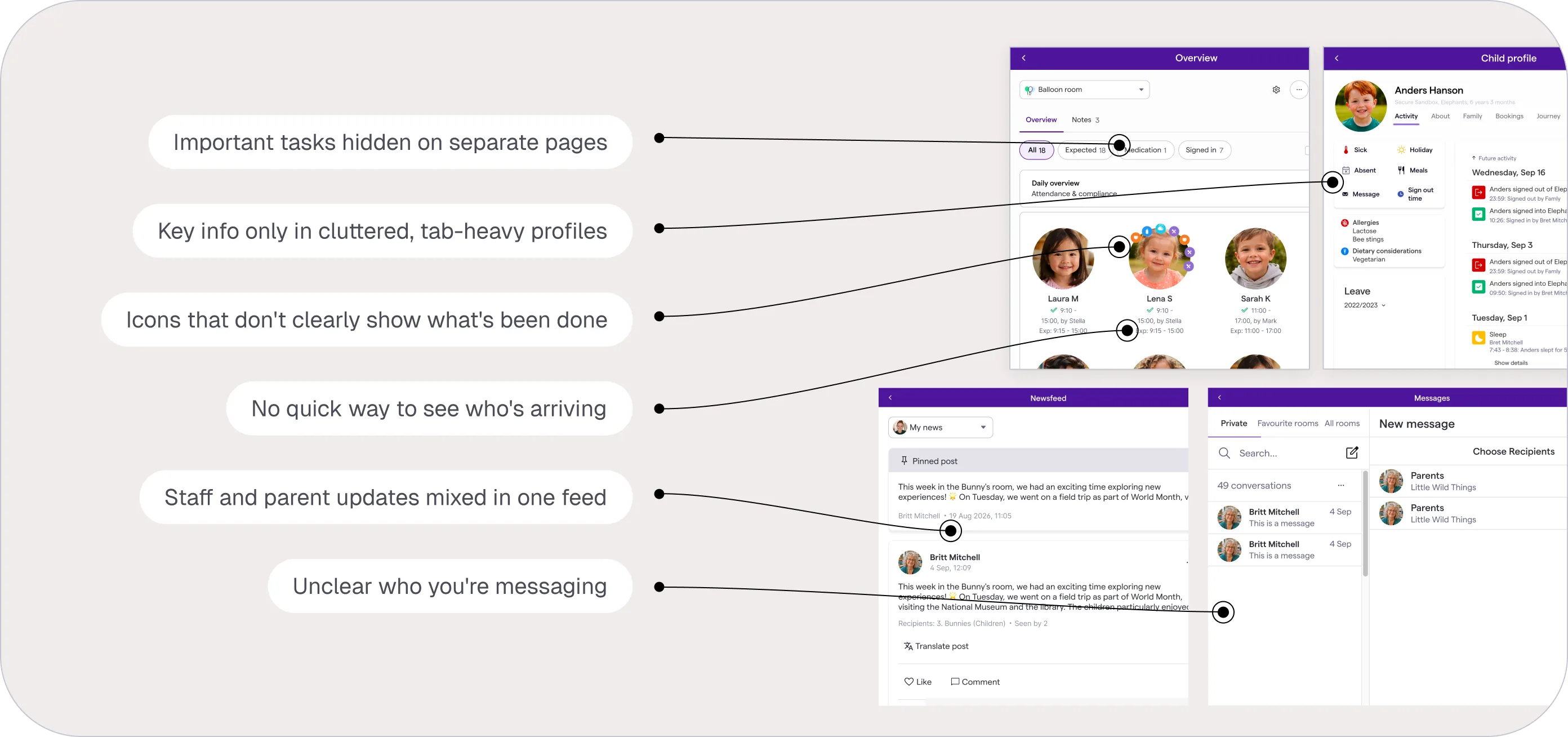
Key findings
Everything asked for attention
Cards, notifications, feeds and “needs your attention” lists all competed for staff focus, with little help telling what was urgent, what needed action and what could wait.
Communication lacked context
The feed mixed staff and parent updates. In Messages, limited identity information obscured who someone was and which child or room they were connected to.
The information existed, but the day was not visible
Staff moved between pages, profiles and icons to understand who was present, what had happened and what remained to be done. Famly recorded the day, but never showed it as a whole.
Product strategy & vision
A new direction for Famly
Move the complexity into the product, not onto the user.
I reorganised the vision around a smaller set of capable tools. Instead of turning every new capability into another destination, Famly would bring related workflows together and reveal the right context, scope and level of detail for each role.
The goal was not simply fewer menu items. It was a product that helped people understand, decide and act.
Staff experience
Bringing a day in the room to life
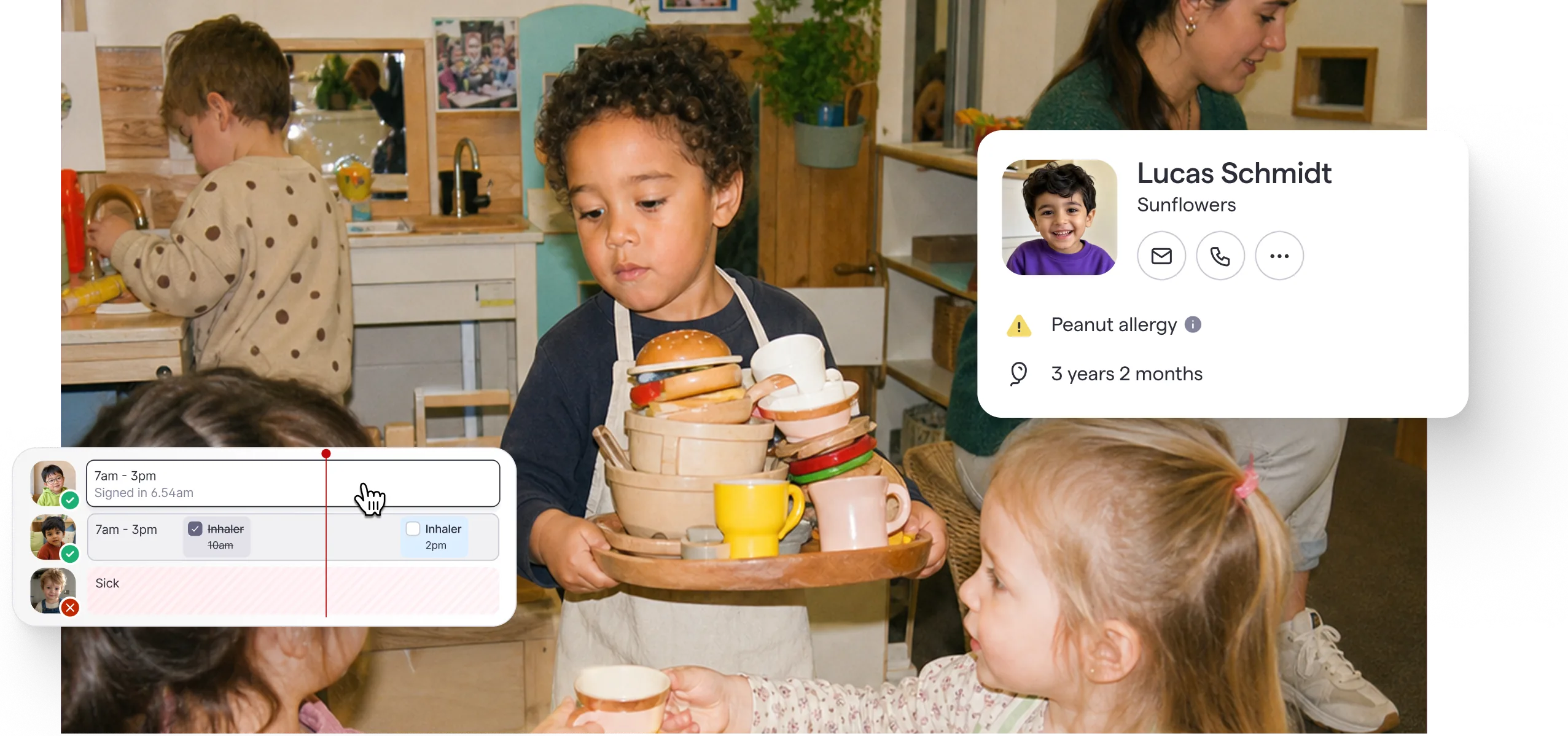
The new staff experience gives practitioners one shared view of what is happening now: who is present, who is expected, who is absent and what needs attention. Staff can move between a visual timeline and a compact overview depending on the task, gaining control over how much information they see without navigating to another part of the product.
A timeline that makes the invisible visible
Attendance, schedules, absences, health information and the actions that hang off them come together on one shared timeline. Instead of decoding isolated status icons, staff see the shape of the day and read the exceptions in context.
Every update, brought into one feed
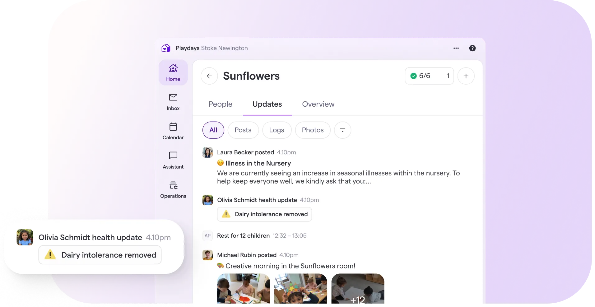
Posts, care logs, health changes and daily activity for a room now share one chronological feed, so a practitioner coming back from lunch reads down rather than hunting across. Filters narrow it to one kind of update when that is what the moment needs.
Communication
Everything important, in one place
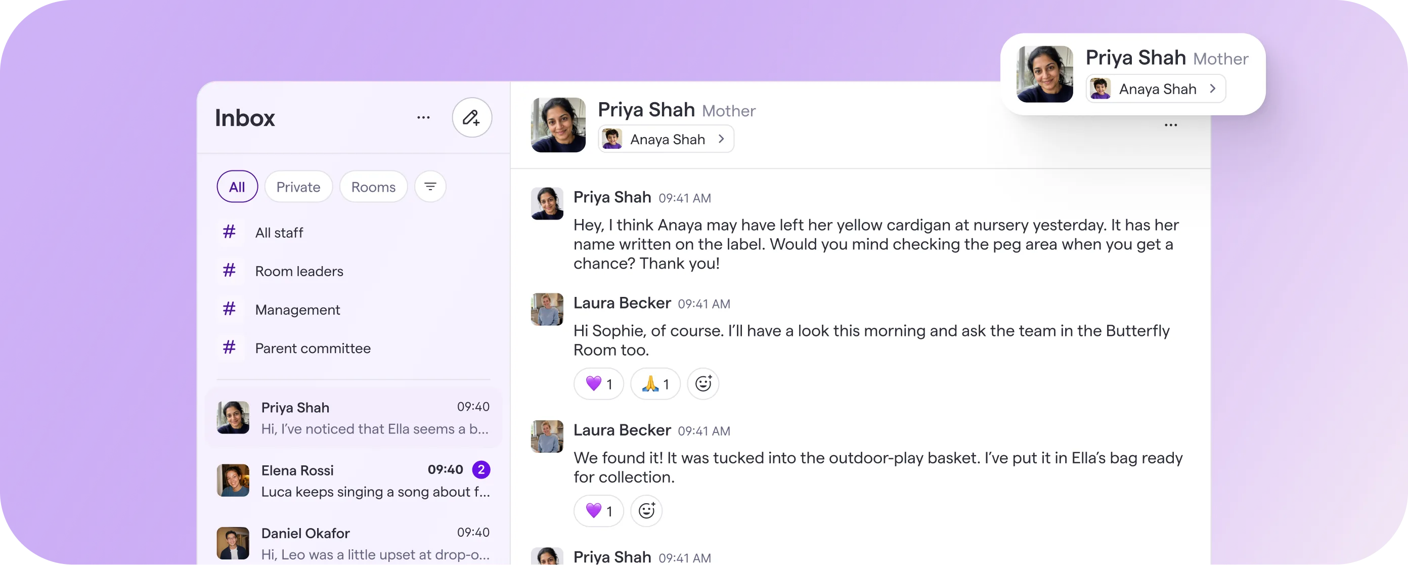
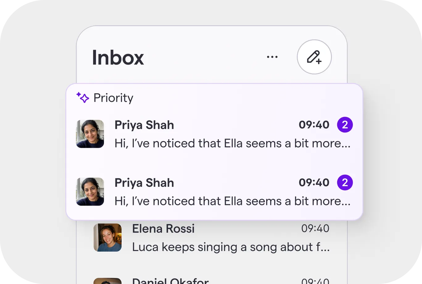
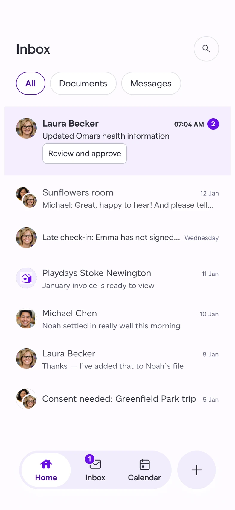
The new Inbox replaces fragmented message tabs with one predictable destination for conversations, actions and approvals. Priority items rise above the stream, helping staff understand what needs a response instead of treating every notification as equally urgent.
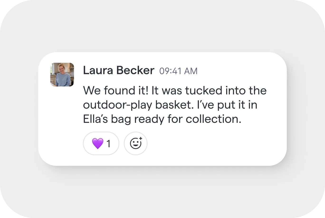
Channels give communication a clear home
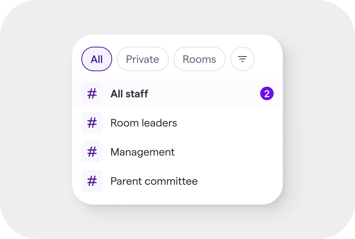
Channels separate communication by purpose and audience: the whole team, room leaders, management or a specific group. Before contributing, staff can understand where a conversation belongs and who will see it.
A reply is not always the answer
Plenty of messages need acknowledging rather than answering. A reaction closes that loop without adding a line to the thread, which keeps the channel readable for everyone who comes to it later.
Profiles
One profile, wherever it is needed
Child profiles had become heavy destination pages with their own layers of navigation. I redesigned them as a responsive system that can support quick identification, provide context inside another workflow or expand into a complete record.
The same profile works as a lightweight panel in Inbox and as a full-width destination for activity, documents and schedules. Important information remains familiar wherever the child appears.
The same profile, at three sizes
Identification, context inside another task, or the complete record. One component answers all three, so what a practitioner learns about a child in the Inbox is the thing they already know how to read everywhere else.
Calendar
One place to plan people, rooms and time
Planning had been distributed across room planners, child attendance, staff schedules, absences, registrations and separate calendar views. I brought these workflows into one shared model.
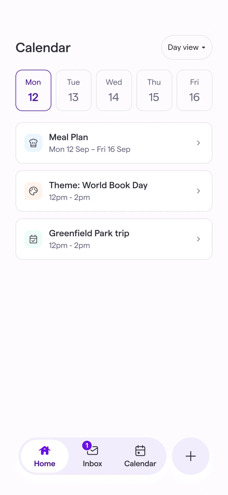
Calendar gives practitioners a clear view of what is happening and gives managers the depth required to plan ahead. Users can begin with a simple schedule, then reveal working hours, absences, ratios and other operational detail when needed.
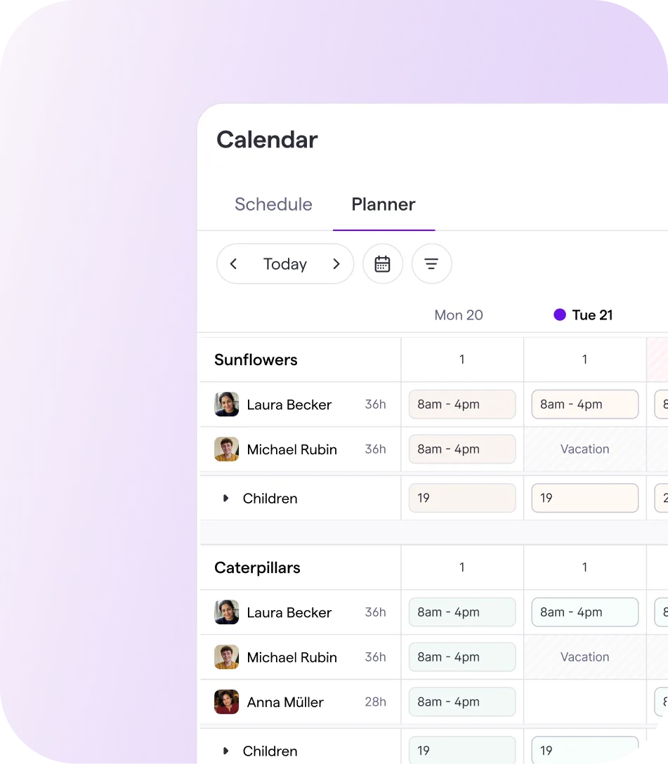
Simple by default, deep on request
Schedule answers what is happening today. Planner is the same model with the operational detail turned on: contracted hours, absences, ratios and headcount per room, for the person whose job is next week rather than this afternoon.
AI strategy
Refocusing Famly's AI strategy
From a bot that could do everything to AI with a clear job
Famly had built technically powerful AI, including a general assistant capable of answering questions and performing different tasks. But adoption remained low. Capability alone was not giving staff a compelling reason to change how they worked.
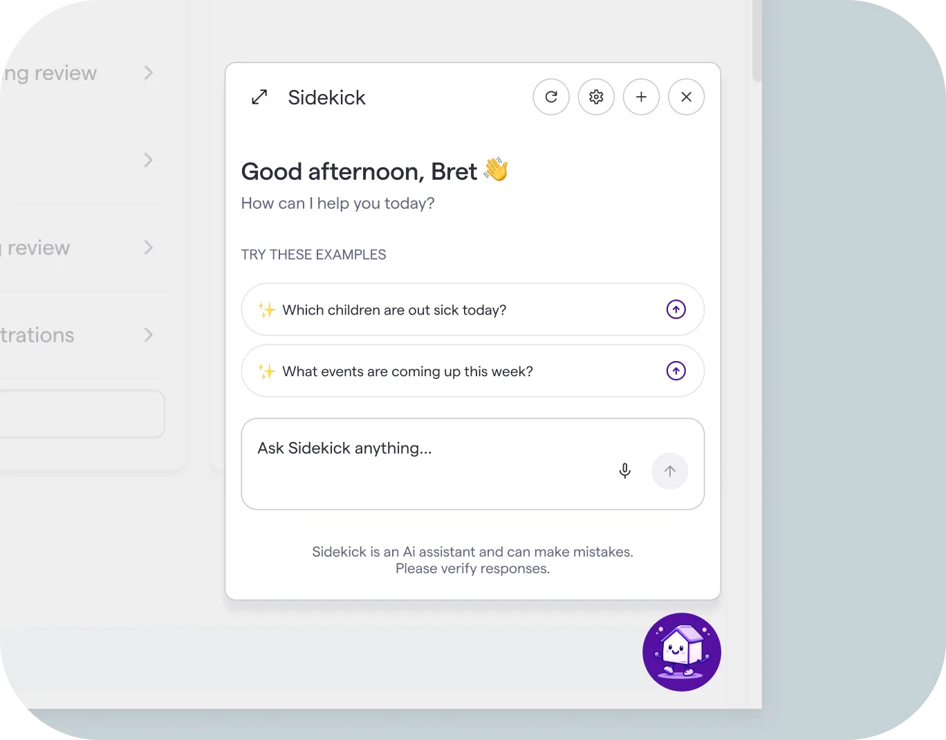
An assistant with nothing specific to do
Sidekick could answer almost anything, which meant staff had to arrive with a question already formed and a reason to leave what they were doing. The handful who used it were managers. In a room, nobody has a spare hand for a chat window.
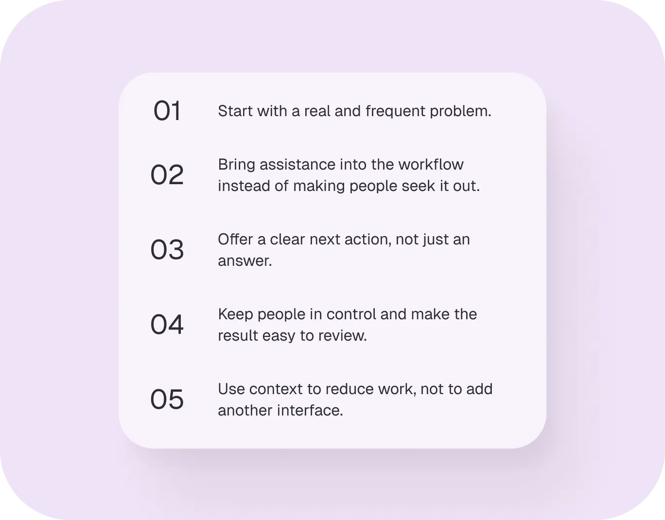
Five rules to argue against
I wrote the principles so a proposal could fail one of them out loud. They are deliberately about where assistance appears and what it leaves the person holding, not about what the model can do — capability was never what we were short of.
Writing support where the writing happens
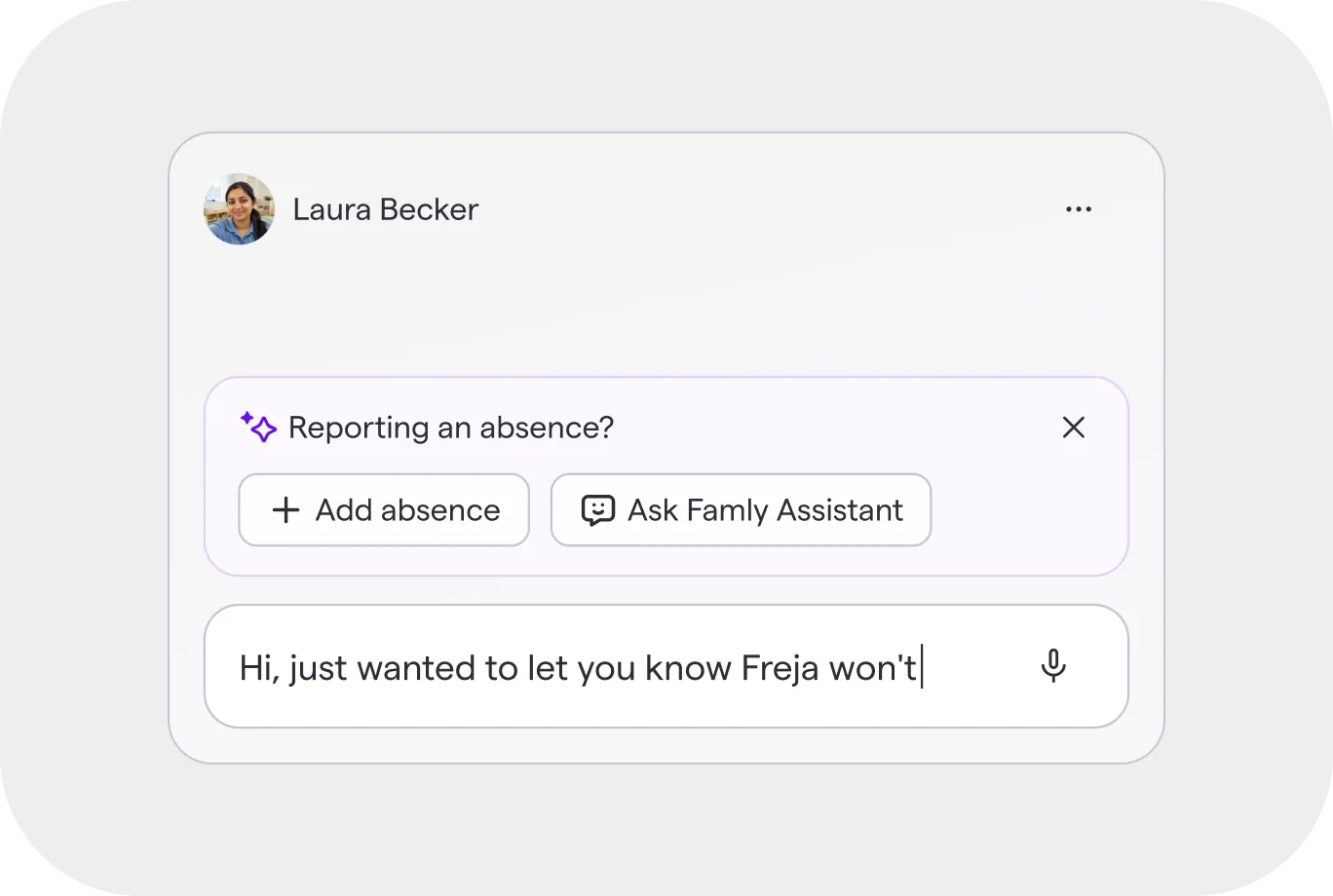
The Writing Assistant proofreads, improves or restyles a message inside the composer the staff member is already typing in. It removes the blank page without asking anyone to go and have a separate conversation with a bot first.
The next action, offered in place
When a parent writes to say a child is off, the message is also an absence that somebody has to record. Famly reads the one and offers the other, so the task is a tap rather than a trip to another part of the product.
Help finding the signal, not another stream
Priority lifts the conversations that look like they need a person out of the same Inbox everyone already reads. Nothing new to check, nothing new to learn — the list just starts in a more useful order.
Parent experience
Radical simplicity for parents
Famly is only one small part of a parent's day
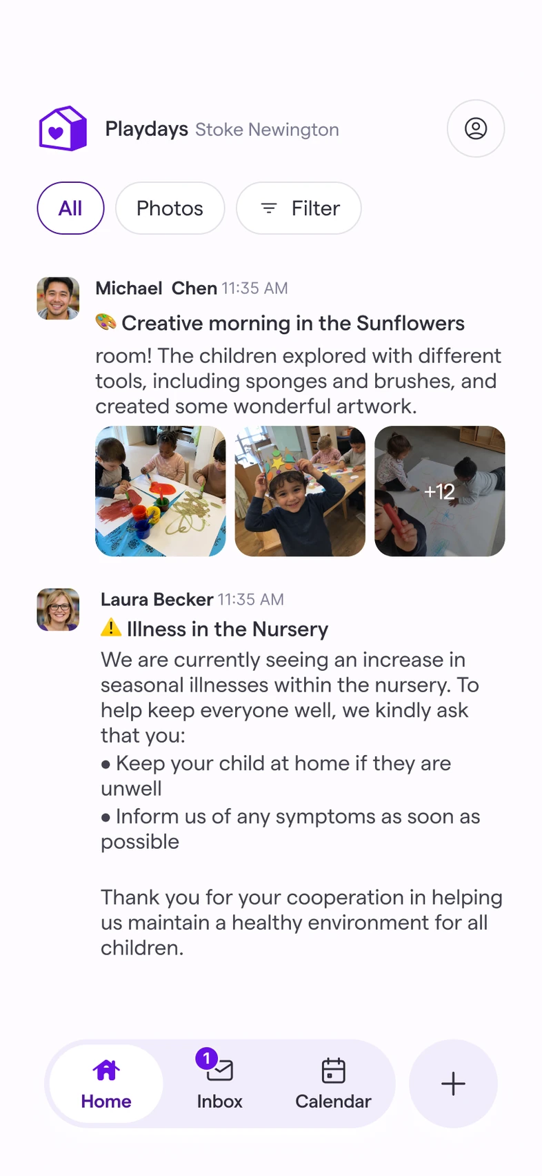
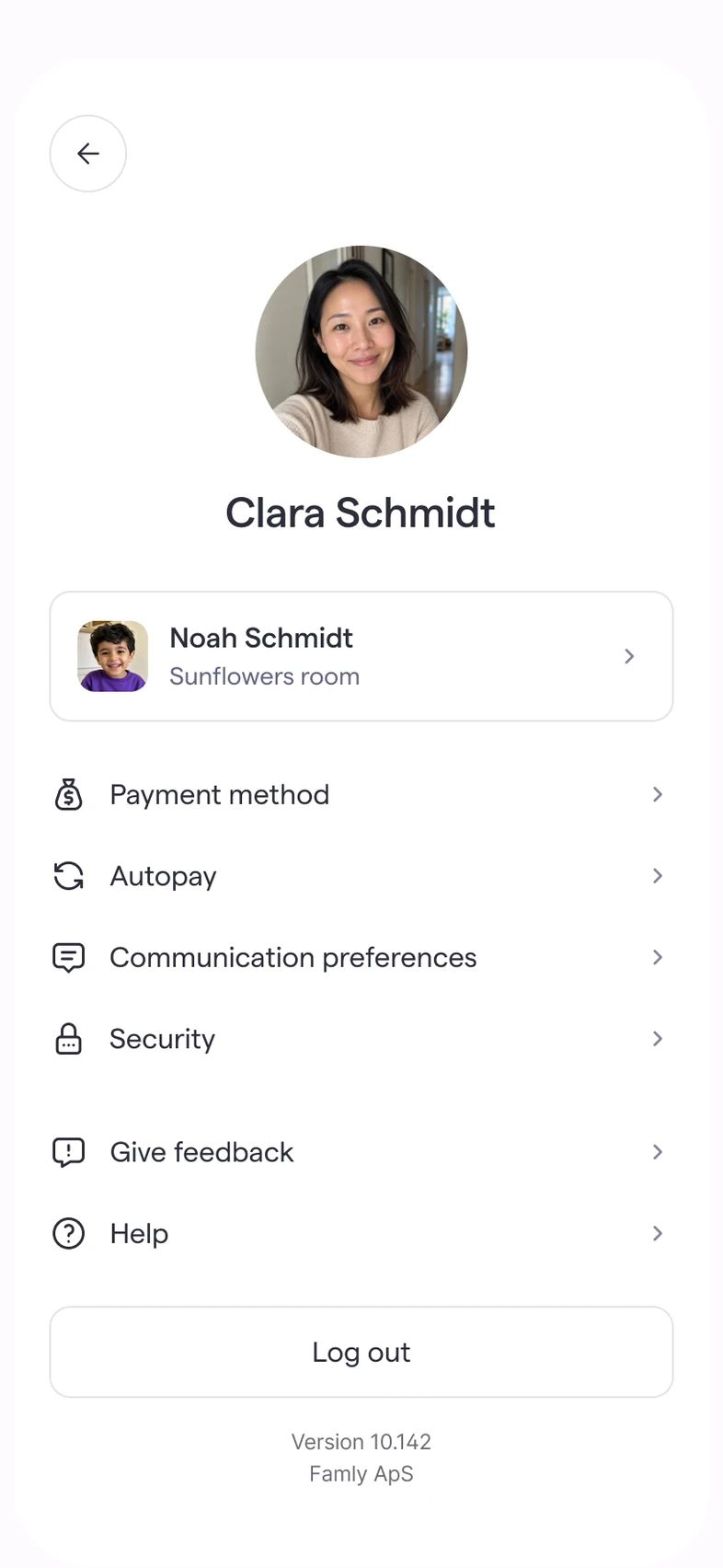
Interviews across our markets reinforced a simple truth: parents do not want to learn a nursery-management system. They want to understand what happened, notice what matters and complete an occasional task quickly. I reduced the parent experience from 14 primary screens to five and designed the product around a clear feed, a focused Inbox, Calendar and one global action.

One action that meets parents where they are
The global action button gathers the things parents may need to do — send a message, report an absence, add information or complete a request — without requiring them to remember where each task lives.
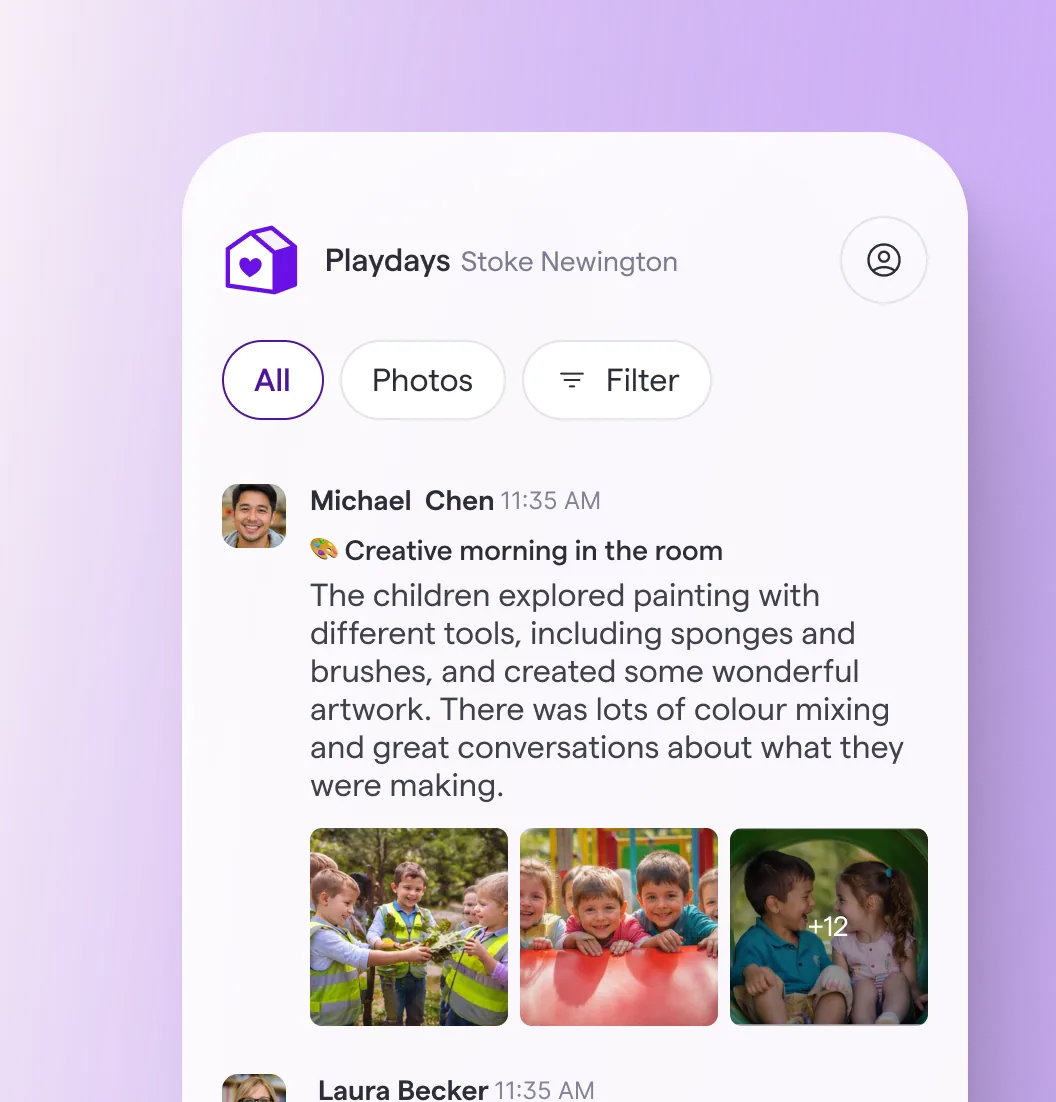
One feed, shaped around what matters
Updates, announcements and moments from the child's day appear in one familiar feed. Simple filters let parents move from everything to only photos or another relevant content type, making it easy to catch up in seconds.